
 Article | 5 min
 Montreal 1976: Design as an element of cultural heritage
A fascination with the iconic design of the 1976 Montreal Games was inspired by an Olympic poster purchased online.
August 19, 2026
When I am asked which graphic design projects have most influenced me, I rarely think of recent visual identities. In fact, I almost invariably come back to the 1976 Montreal Olympic Games.
| Visit the virtual exhibition Beyond the Games – Montreal’s Olympic Story! |
Though created a half-century ago, this identity strikes me as contemporary as ever, and not because it is trendy or a throwback to modernism. Its visuals simply remain exceptionally clear and on point, even today.
The birth of a fascination
My love affair with the 1976 Games began with a poster.
When I began looking for objects associated with Canadian modernism to decorate the offices of design studio Principal, I happened upon this poster of the Olympic rings appearing to flutter like a flag, against a red background. I was struck by the fact that the poster could very easily have been created today. I found it on an online auction platform. Convinced that a piece like that would likely cost a fortune, in the end we purchased it for around twenty dollars.
It still hangs on our walls today. Furthermore, its colour remains the signature colour of our studio, even after nearly 15 years.
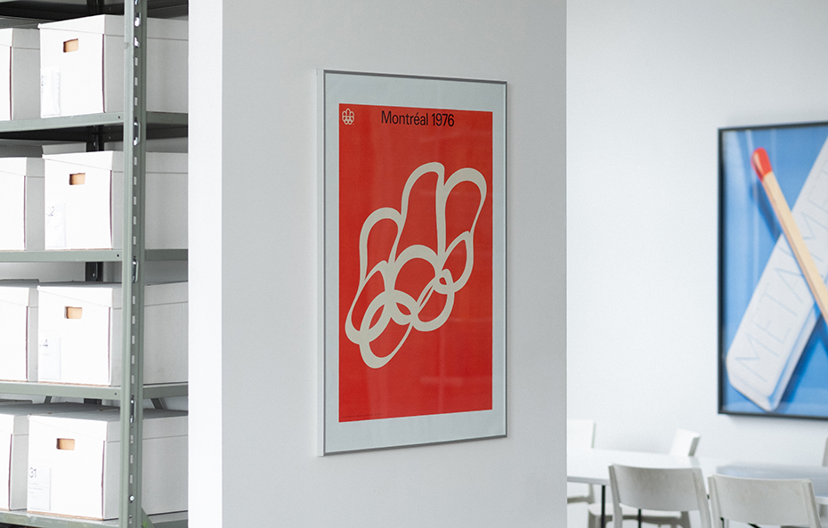
Over time, I feel the poster has become a reminder of the power of design when reduced to its essence. I love the tension it creates. Everything about it is perfectly constructed. A structured grid, simple composition, and an almost radical efficiency. And yet, right there in the centre, a disarmingly light flourish: the logo of the Montreal Games, seemingly floating in the wind. With this simple idea, the image of the rings comes to life.
What impresses me most about this poster is its restraint. Nothing is superfluous. Everything appears obvious, almost easy. The best design is not necessarily that which does more. Often, a single powerful idea, well executed, is enough to create something that transcends time.
Visit the virtual exhibition Beyond the Games: Montreal's Olympic Story.
A framework for creative expression
I later discovered the series of ten posters chosen and published by the Artists-Athletes Coalition, which impressed me for an entirely different reason.
The graphic system devised by designer Burton Kramer is incredibly straightforward: a black frame, a neutral yet striking typeface, and a perfectly balanced grid layout. Finally, in the centre, a space for the creations of artists like Michael Snow, Jean McEwen, Guido Molinari and Claude Tousignant, who were each given the freedom to propose their own interpretation. (A copy of McEwen’s poster hangs in my living room, a gift from my spouse.)
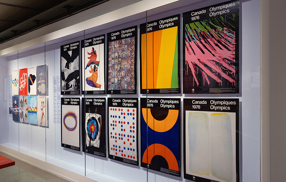
I really love the contrast of a uniform framework that leaves room for self-expression. A balance between engineering and art. I find it an extremely generous approach. The design does not impose a single aesthetic; instead, it sets the stage for a number of voices to coexist.
The grid is not there to flaunt technical virtuosity. Instead, it provides a sort of underpinning. It does not overwhelm the artists, but provides them with a solid framework to encourage their self-expression.
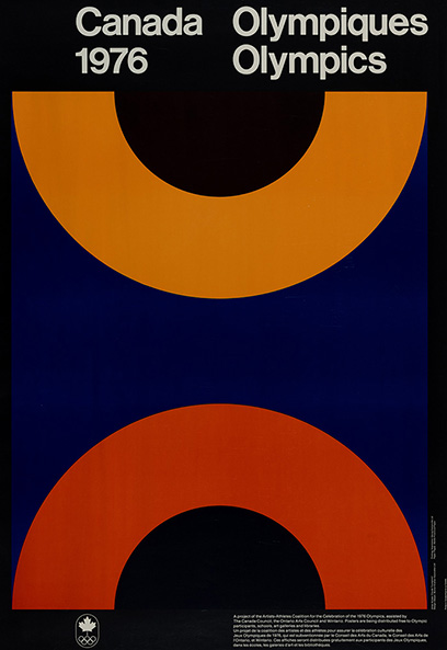
These posters also demonstrate cultural ambitions rarely seen nowadays in this type of project. Their aim is not only to promote a sporting event, but also to present the Games as a convergence of design, art and society. Today, the Olympics tend to adopt a more commercial, advertising-based approach. In my opinion, it is a lost opportunity to promote local artists and cultures.
When I work on projects for the studio, I often think of this way of designing a graphic system. Not because I am trying to reproduce the aesthetic of the Montreal Games, but because this approach reminds me that the goal of a good system is not to create uniform ideas. On the contrary, it must enable ideas to exist, evolve and adapt without losing consistency. It creates a dialogue between discipline and flexibility.
A symbol of the irrepressible energy of a generation
One other poster holds pride of place in my collection: that of Raymond Bellemare, depicting a jean jacket festooned with buttons. The first time I saw it, I was struck by its tremendous sense of freedom.
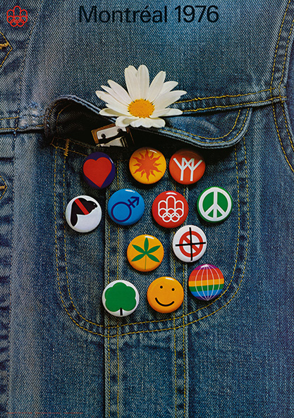
Firstly, the poster is a photograph and not a drawing or block of colour. Secondly, and more importantly, the buttons represent social causes, identities, and grassroots movements. Symbolizing the irrepressible energy of a generation, it is a portrait of society in the 1970s rather than a poster about sports. It does not try to explain everything. Instead, it has faith that the viewer can figure it out. The pins represent love, gender equality, back to nature, the search for spirituality, inner harmony, fellowship, and even a marijuana leaf. The poster is actually quite daring!
Visit the virtual exhibition Beyond the Games: Montreal's Olympic Story.
I cannot imagine it being made today. It makes too much of a political statement. However, that is exactly what makes it so special: it reminds us that an event of this magnitude could also be used as a platform to express a world view. To celebrate not only sports, but also culture and diversity of thought. In short, a form of social innovation. I am not sure if organizations are willing to risk this sort of thing today. I would like to think they would, but it may be a pipe dream.
Timeless design
Looking at these works today, I realize that they all have something in common. Their relevance stems not only from their aesthetic, but also from their ambition. They show that a visual identity can be both exacting and expressive, that a graphic system can organize information with precision while still leaving room for poetry. I believe that the visual identity of the 1976 Games is a reflection of who we were in Montreal.
This is a recurring topic in our conversations. We have many objects from the Games in our library and on the walls of the studio. Not because we are trying to copy their aesthetic, but because they remind us of an ideal: a design approach in which rigorous standards create space for ideas to flourish.
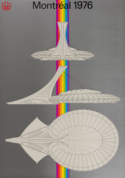
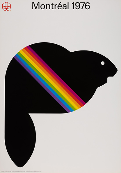
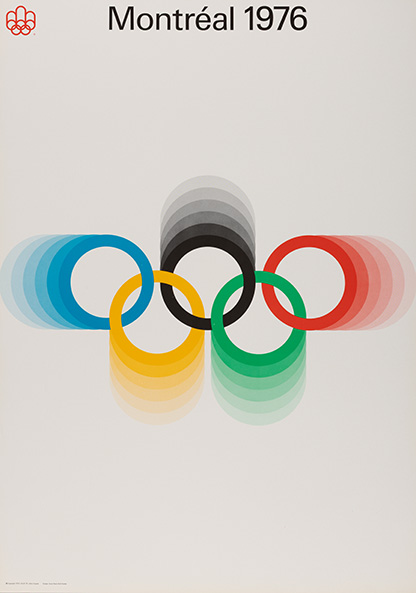
In the end, that is perhaps the aspect that resonates with me the most. These objects from the Montreal 1976 Games are not simply mementos of a sporting event. Having become artistic benchmarks in their own right, they continue to influence an entire generation of designers who were not even born when they were created. Very few projects can make this claim.
The best designs do not become relics. They become icons.
This fifty-year-old poster of the rings, acquired after spending an afternoon online and twenty dollars, is a constant reminder that a design created with ambition, precision and humanity can stand the test of time without losing its relevance. And that good design never goes out of style.
About the author


See also
 Article

 Video
Video